

CSS animations make an element of the web page move or change its appearance during an action by the user. Modern websites use animations to draw the user's attention and make the navigation interactive.
Animations help make the website dynamic and offer a satisfactory user experience.
So let's see how we can make our own animations.
How to add animation to a website?
1)- animation-name and animation duration
To apply an animation to an element we should first of all give this animation a name and a duration.
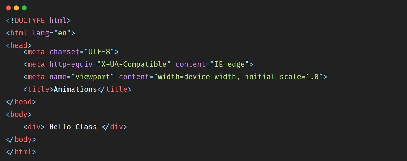
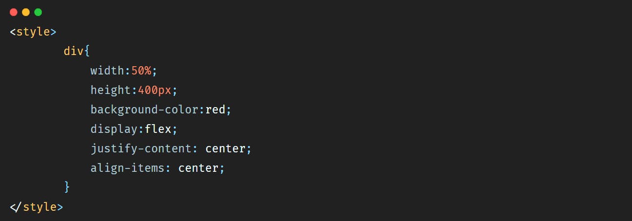
Let's say that we have a simple <div></div> where we will add some text and we want to animate it.
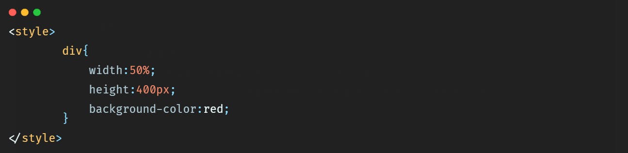
We will give the <div></div> a width of 50%, a height of 400px and a red background-color. So the HTML will be:
 And the CSS that you can add inside the
 <head></head> tag will be:
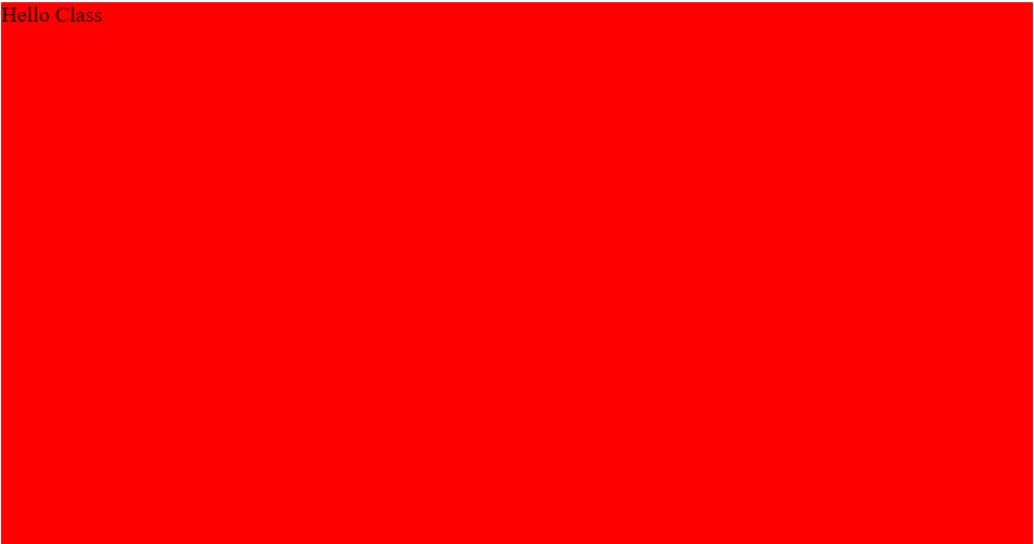
 So in the browser we'll have a simple
 <div></div> like this:
 Let's add a display flex style to center the text in the middle of the
 <div></div>.
 So in the browser we have:
 Now let's animate our
 <div></div>. Let's say that we want the background-color of the
<div></div> to move from red to yellow.
First of all we should add a name to this animation so that we can capture it after, and then we should add a duration to say how long should it take for the <div></div> to go from red to yellow.
So the code will be:
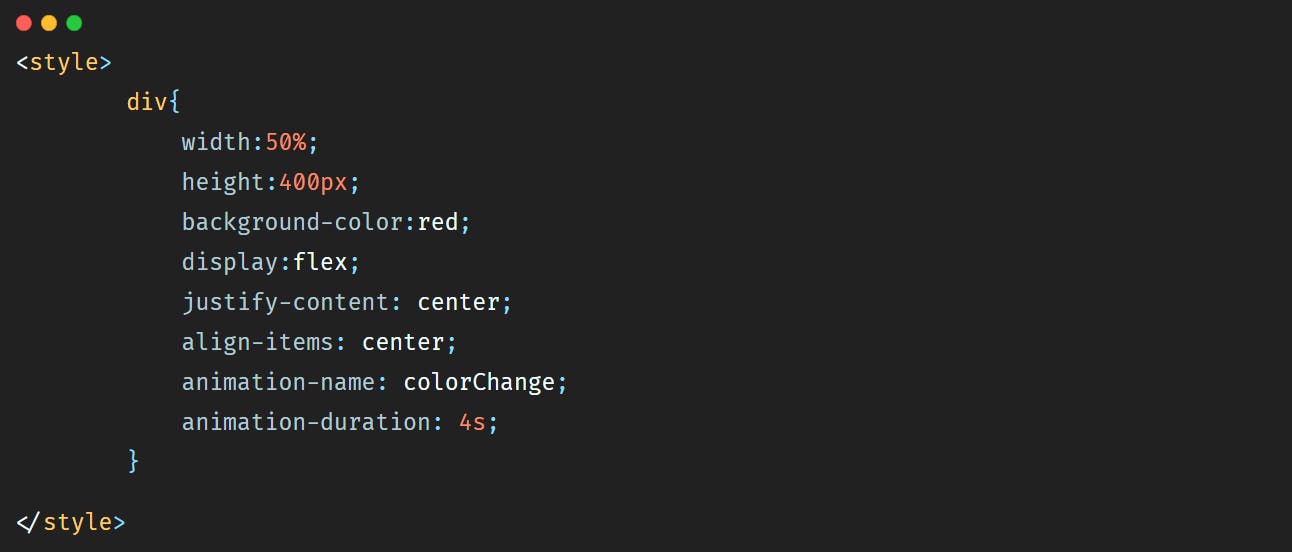 So here the animation-name property allows us to give a name to our animation. And animation-duration allows us to give a duration to the animation.
But by adding these properties only we will not see anything on the browser, nothing will happen.
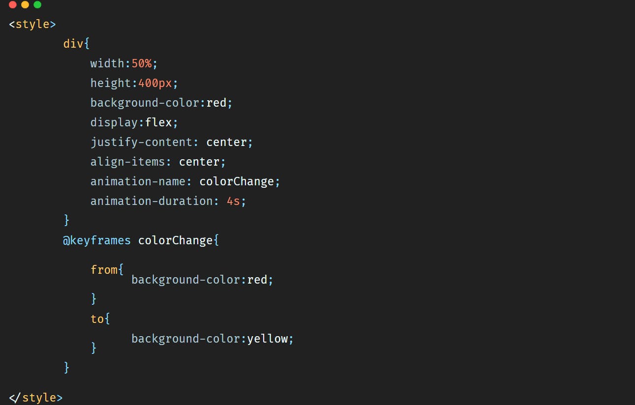
To run the animation we should use the @keyframes property and add to it the name of the animation like below:
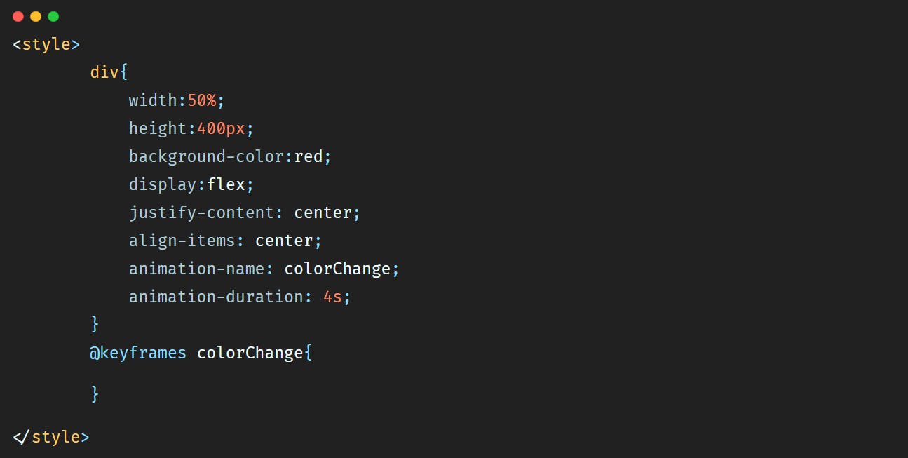 The @keyframes property defines a starting point and an ending point for the animation, which will be expressed by adding keywords from and to.
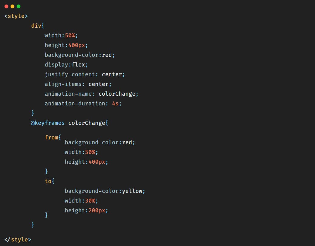
So to make our <div></div> go from red to yellow within 4s we'll add the code below:
 So in the browser we'll have this animation:
<div></div>. Let's say that we want the background-color to change, but we want also the width to become 30% and the height 200px.
The code will be then:
 In this case the animation will be:
Now let's say that we want to change the background-color of the
In this case the animation will be:
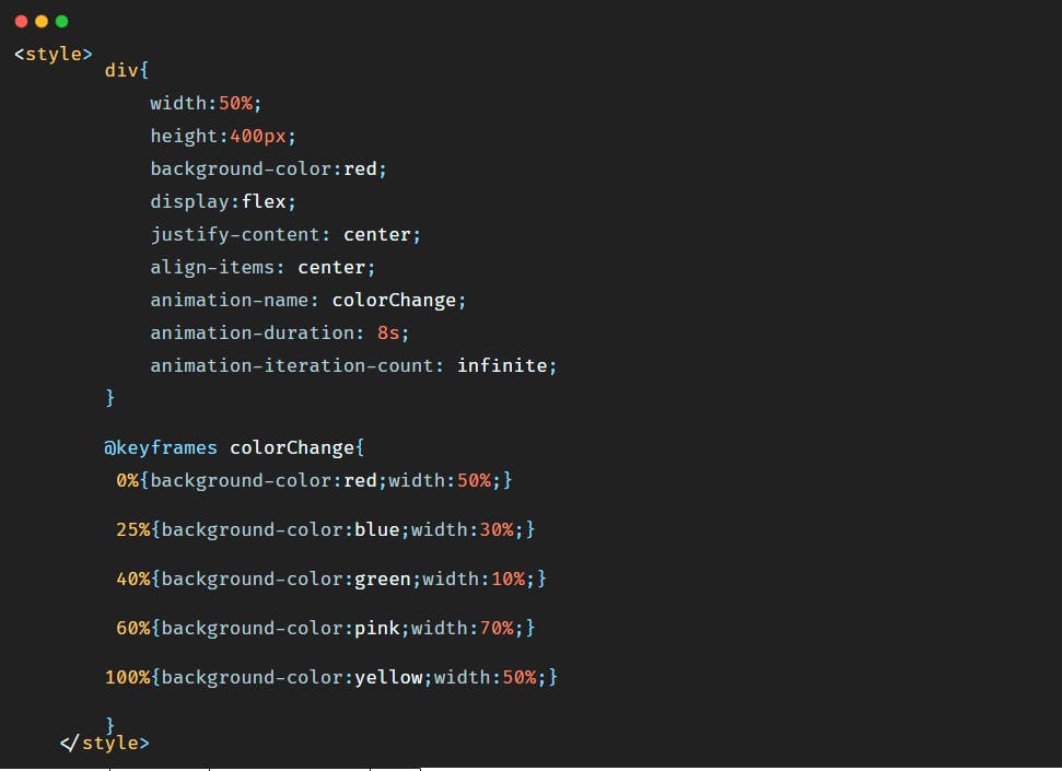
Now let's say that we want to change the background-color of the <div></div>, but this time we want the background-color to be blue first, and then green, and then pink, and then at the end yellow. And let's make the duration of the animation 8s to have time to see it.
So the code will be:
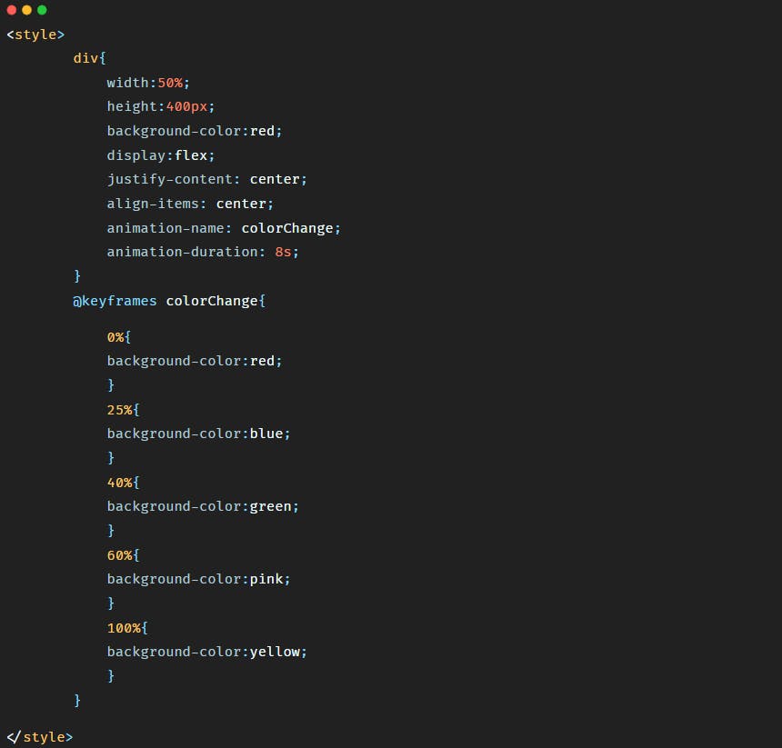 Here as you have probably noticed, we removed the keywords from and to and used percentage instead. It is because by using percentage we can define more styles that we want to see during the animation of our element.
The animation will look like:
Here as you have probably noticed, we removed the keywords from and to and used percentage instead. It is because by using percentage we can define more styles that we want to see during the animation of our element.
The animation will look like:
2)- animation-delay
animation-delay property allows us to add a delay to the start of the animation.
Let's say that we want the animation to start after 5s, and let's say this time we want to change the background-color and the width at the same time. So the code will be:
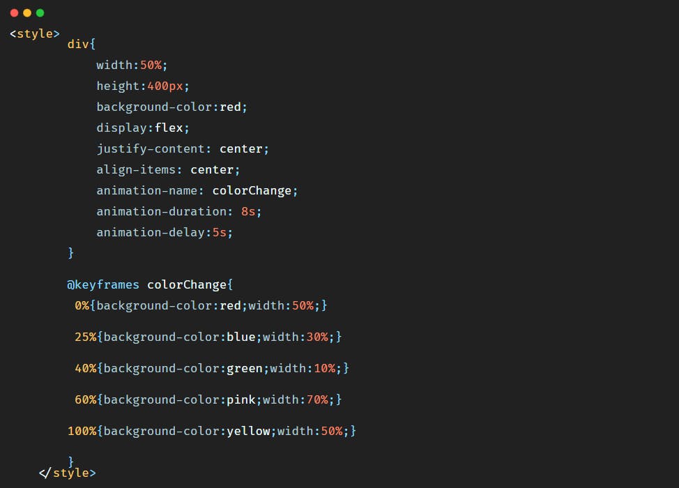 We added the animation-delay property inside the div selector and the width value inside the @keyframes property.
So in the browser the animation will be:
As you have probably noticed at the beginning of this video, when I clicked on the refresh button of the browser, The animation did not start right away, there was a delay of 5s before the start of the animation.
3)- animation-iteration-count
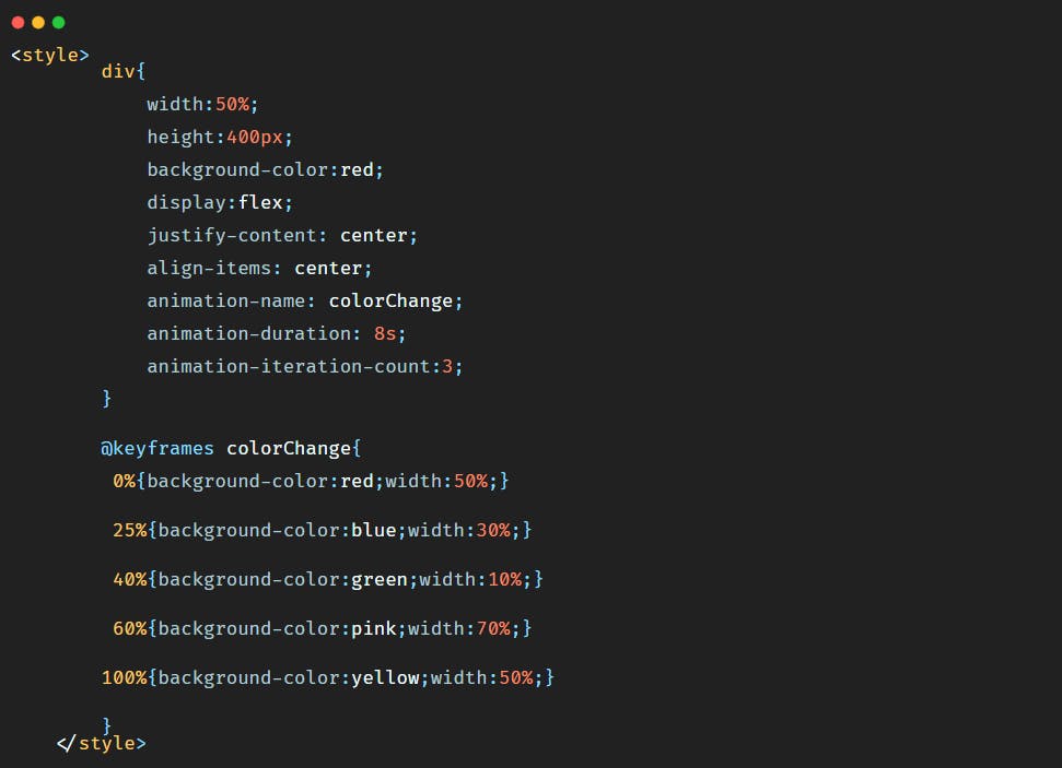
Now let's say that we want this animation to be repeated for a certain number of times. In this example we want to repeat the animation 3 times.
There is a property for that, this property is animation-iteration-count.
Let's remove the delay, so the CSS code becomes:
 So in the browser we'll have the following animation:
If you want the animation to run for ever all you have to do is to set the value of animation-iteration-count to infinite like below:
4)- animation-direction
We can also reverse the direction of the animation if we want, or alternate between forward and backward animation.
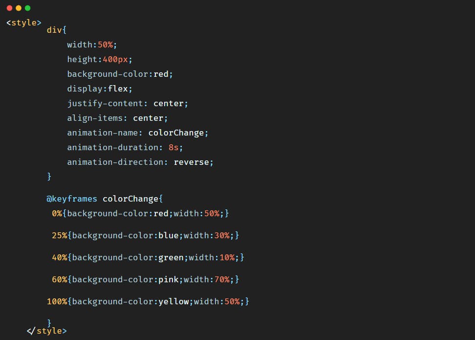
To reverse the animation we should simply add the CSS property animation-direction and give it a value of reverse.
So the code becomes:
 In the browser we have:
As you have noticed, the animation was supposed to start with the red color first, and with a width of 50%, but as we reversed it, it starts now with the yellow color and a width of 50%.
To alternate between forward and backward animations we should just give the animation-direction a value of alternate.
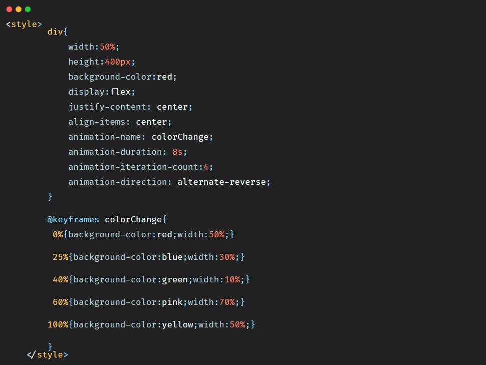
But to see the alternate animation we should also repeat the animation for a certain amount of time. Let's say we want to repeat the animation 4 times and alternate at the same time the animation. So the code will be:

So the animation will be:
So here the animation started the first time with red color and ended yellow, and for the second time went from yellow to red, and for the third time from red to yellow, and for the fourth time from yellow to red.
There is also the value alternate-reverse that makes the animation run backwards first then forward.
So the code will be:
5)- animation shorthand
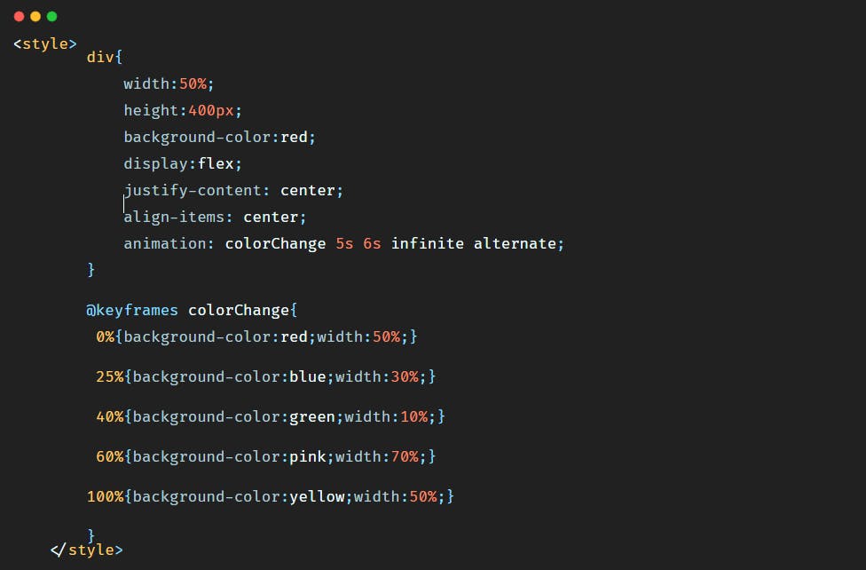
As there are many animation properties, we can use a shorthand to put all values inside one CSS property that is animation.
So if we want for example the animation to run for 5 seconds, for ever with a start delay of 6 seconds and to be alternate we will write the code in this particular order:
Conclusion
Animations offer more control over the change of values of the properties concerned since we can control this change of value as a whole.
Animations help make a beautiful website and in this tutorial we've seen many animation properties that we can add to give different effects to our HTML elements.